


What is "Texture"?
And why I spent three days chasing it. (AKA my attempts at Kitchen Lithography.)

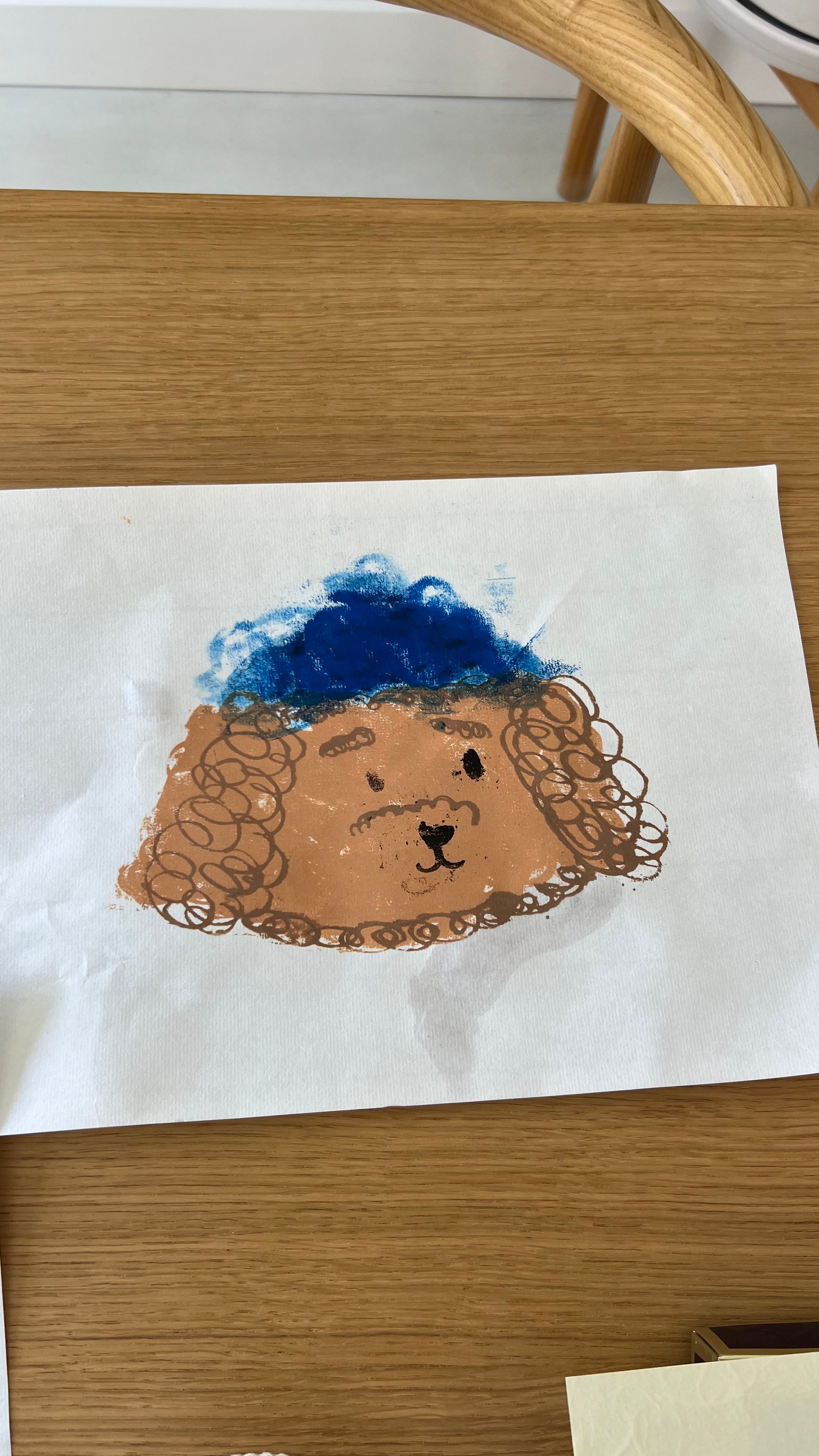
“I COULD FUCKING PAINT THIS IN FIVE MINUTES!!!”
I yelled, frustration taking over my voice, “and INSTEAD, I spend THREE days meticulously labouring over this print… for WHAT?! For this fucking mess?!”
I tossed a paper with a smudgey dog’s face at Rob’s feet. Poor guy had come upstairs at the worst possible time.
A few moments later, we both laughed at the ridiculousness of the situation. “Sometimes I think I just like to make life harder for myself.” I muttered as I rolled my eyes, begrudgingly picking up the paper off the floor.
And by sometimes, I think I really mean most of the time. I could easily create drawings with my iPad using various $20 brushes that mimic ink, paint, or pencil. Instead, I purchase the real tools (what I call “analog illustration”) and spend time mixing colours and waiting for things to dry, with no “undo” button in sight. It’s expensive, time-consuming, and makes no practical business sense.
But it also feels like resistance. A lot of artists and illustrators will often cite “texture” for the main reason of going analog. The term is often used as a direct opposite of “flat”. “Flat” can mean a lack of visual or meaningful depth, but also bland, boring, basic, blah.
Flat feels stiff.
Flat feels too perfect.
Flat is, generally, undesirable in any creative medium.
There is something beautiful about the way the colour of paint changes as it dries on paper, the way a print (the traditional printmaking kind, not the one that comes out of a printer) can reveal unexpected results depending on things like humidity or pressure.
“Texture” is why film photographers still exist.
“Texture” is what elevates someone’s clothes from drab to dramatic.
“Texture” are the messy moments of life that makes it interesting.
AI has been on my mind this month. In particular, AI artwork which feels like the epitome of “Flat.” It is perfect, and smooth, and effortless. It’s a shortcut. And I wonder, what are these shortcuts for? So that we can make more, produce more, create more, earn more, scroll more, buy more, spend more, and fuel the cycle that is capitalism? 🙃 If the shortcuts actually meant that we could spend more time with loved ones, on hobbies, and on those textural life moments, then sure, I’d be an AI optimist.
Until then, you’ll find me here, scribbling away, with a pen in hand.
A heads up:
If you are attuned to the cadence of this newsletter, you’ll notice that I’m missing a print of the month/ free digital wallpaper of the month. (Or maybe you didn’t notice and that’s OK too.) I had initially intended to turn this aforementioned litho print of the Tombolo dog into a downloadable print but… well.. gestures to the essay above.
So in return, I’ve decided to make this process post/ essay free to all and will circle back with two new prints next month! Thank you for your forgiveness. 🙏🏽

My Kitchen Lithography Process:
I will say, before diving in, that everything I know about Kitchen Lithography, I learned from Viola Wang’s workshop and I’m still just experimenting/ having fun as a beginner.
For anyone new here:
1.) I got into Lithography/ print-making last year, and while I love the process of making prints from stone, the cost (studio space, mentorship) has been an impediment; so I was thrilled to discover I could make similar prints at home.
2.) Lithography is basically making prints through the manipulation of the principle that oil attracts oil, and is repelled by water.
3.) Printmaking is hundreds, if not thousands of years old and was the original way to create duplicates of an artwork before printers came around. (See aforementioned essay about texture for why folks still do this in the year 2025.)
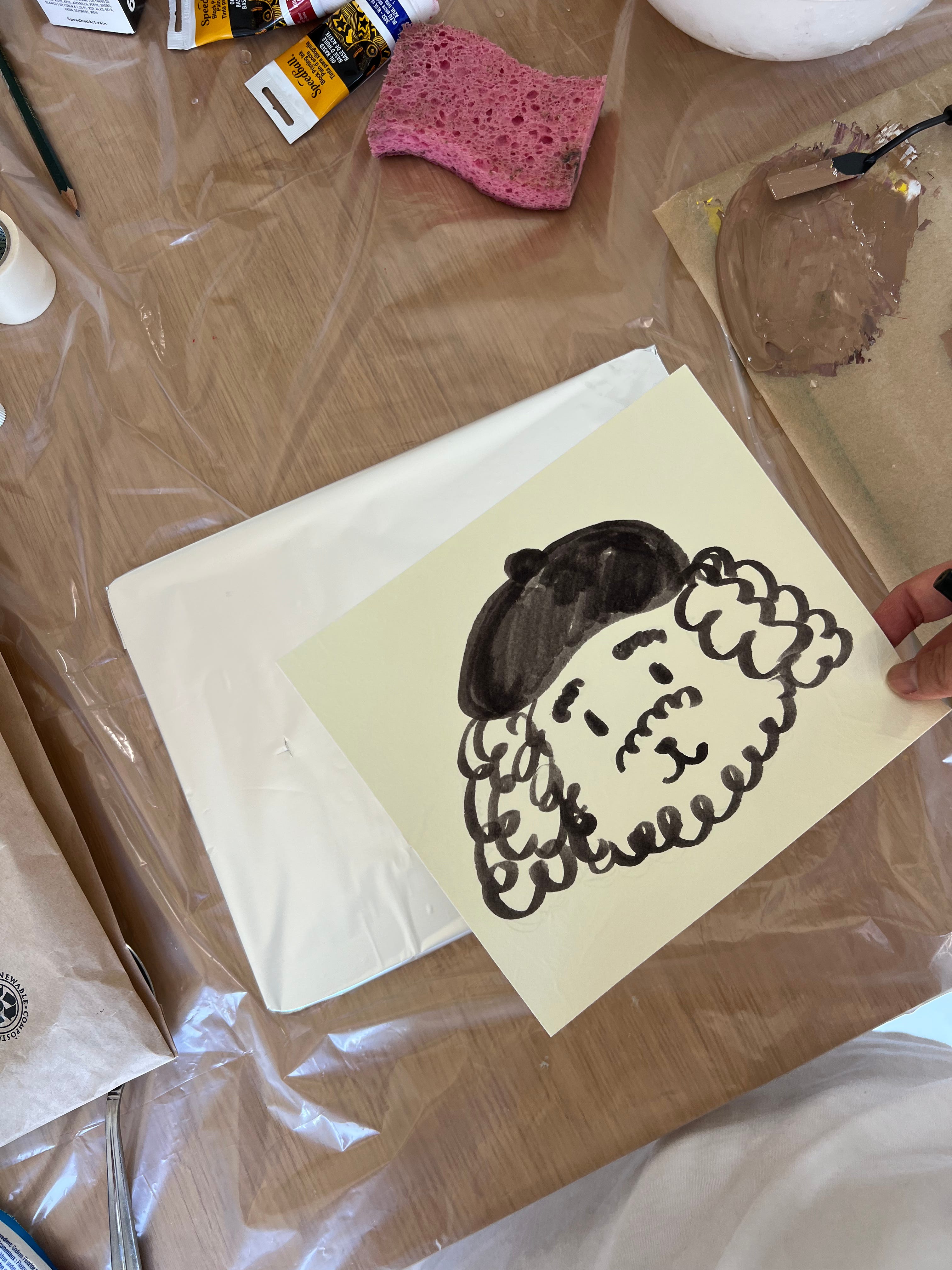
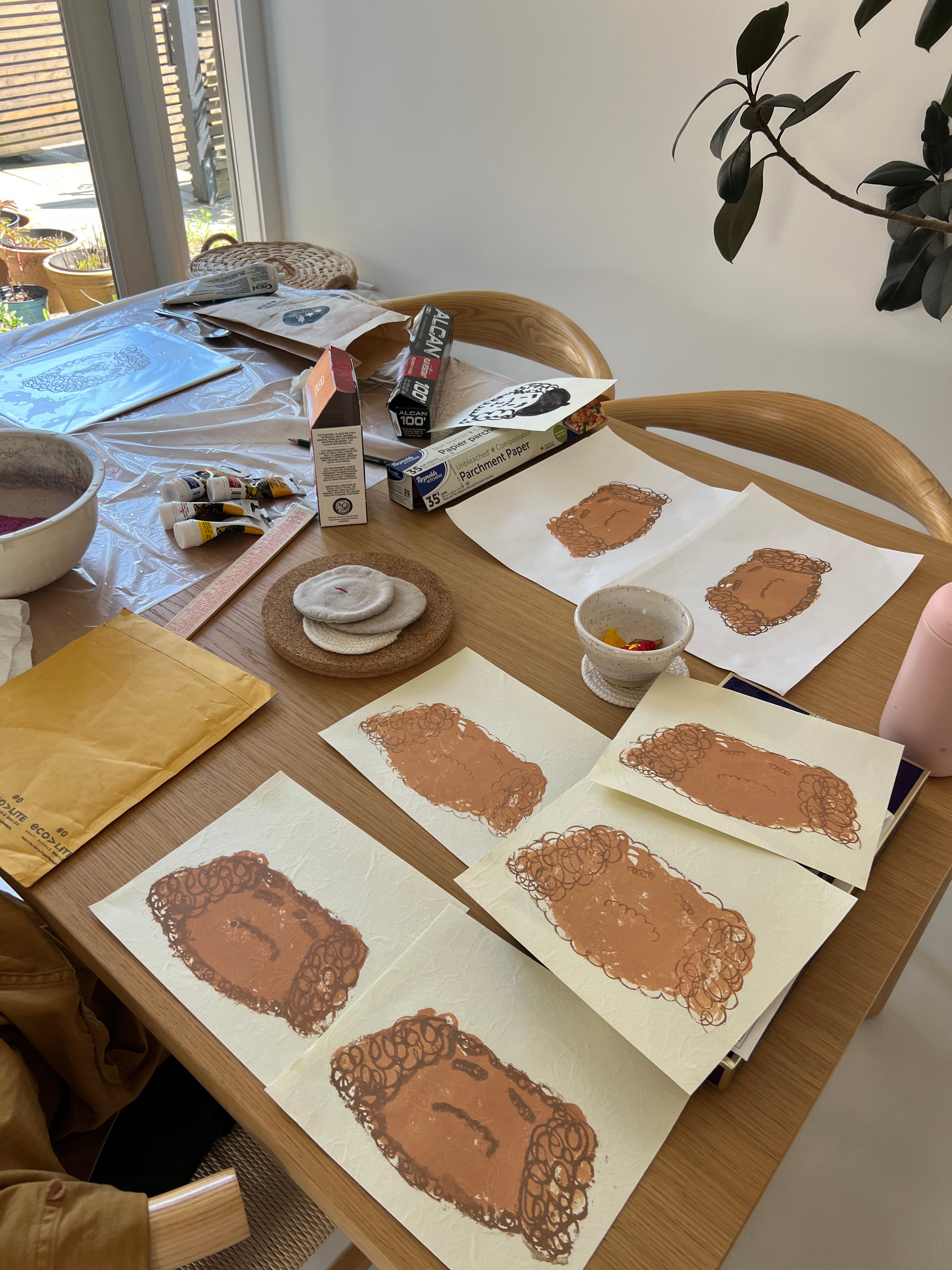
Step 1: I drew the artwork on a piece of paper that would then be used as a reference piece/ used to register the prints on each plate. Registration is the process of lining up the to-be-printed-on paper with the plate so that the different colours would print on top of one another instead of slightly off-center. (This will make more sense in a moment.) Since this was my first time experimenting with multi-coloured prints, I thought it would be a good idea to start with a slightly simple design.
Step 2: Draw the design on the plate with a greasy substance. I’m using a special litho crayon here but I was also experimenting with other things like chocolate. Note that this was my day 2 design as I forgot to film day 1.
Step 3: Acid! The acid is used to “etch” in the design on the plate. This part honestly feels like magic. In traditional print-making, you would need to don gloves and use proper acidic substances but at home, we use coke. Which… has me questioning the contents of coke. 🤪
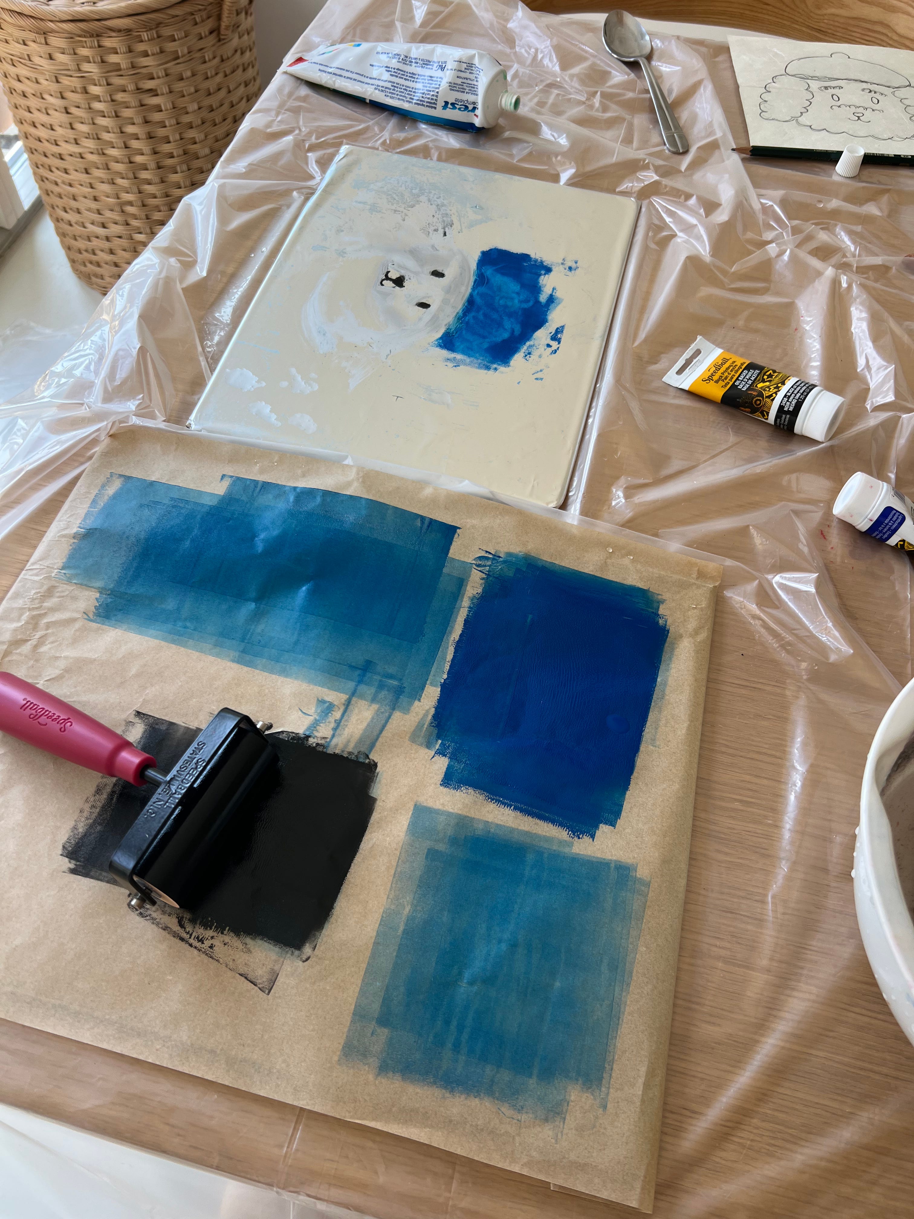
Step 4 & 5: Mix the ink colours and roll it out.
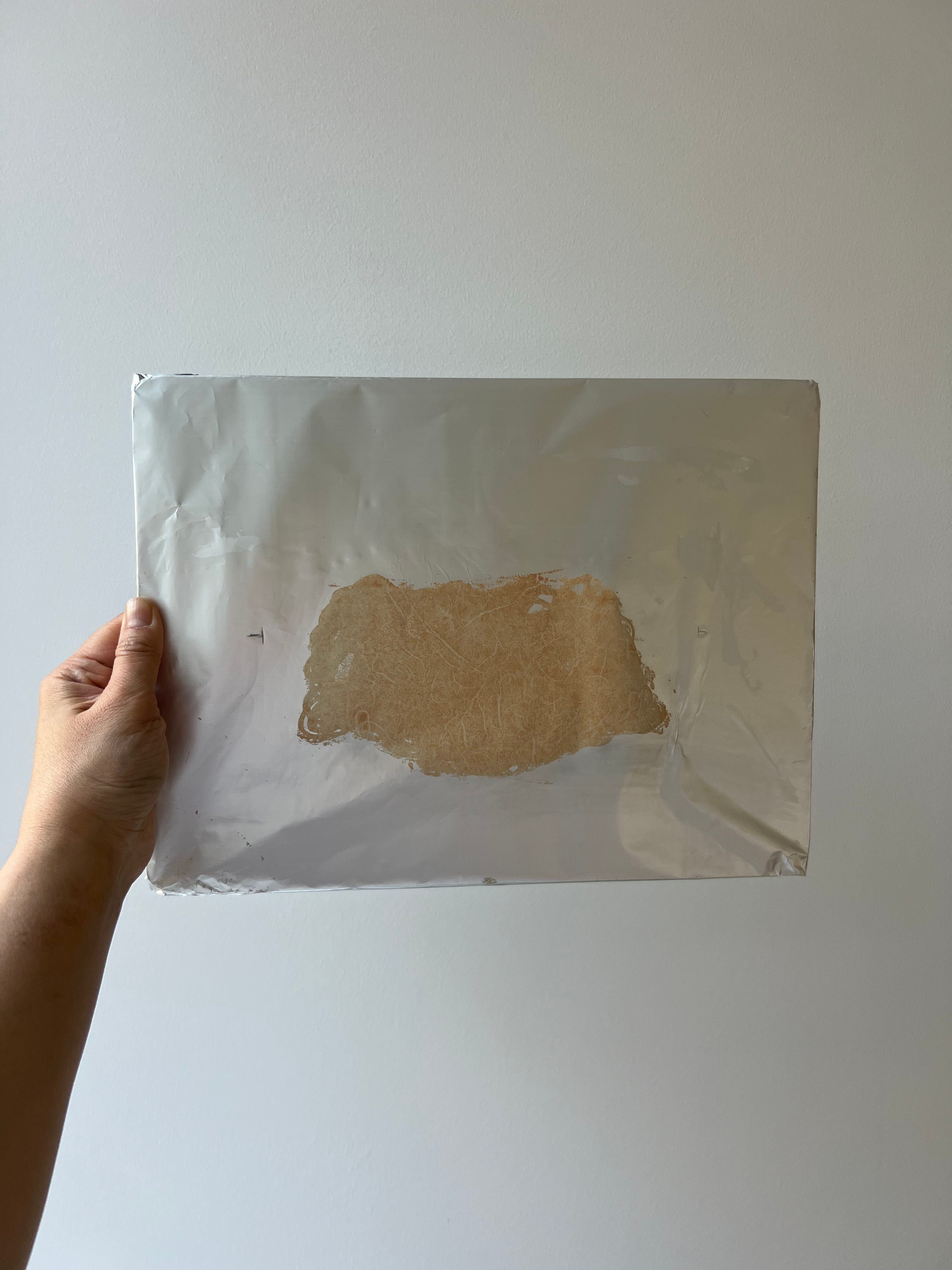
Step 6: Roll out the ink onto the design. This is the tricky part because if you’ve done everything perfectly, the ink should ONLY stick to the drawing, and should not leave smudgey bits on the aluminum foil.
Step 7: Print onto the paper! I don’t actually have a photo or a video of this step but here is my completed plate from Day 1. (All the videos above are from day 2 but it’s the same process.) For Day 1, I was focused on a light brown “base” for the dog and it turned out pretty good!
You can see my tester prints on the larger thinner sheets of white paper, and then the “real” prints on the cream paper below. These prints take at least a day to dry so at this point, I packed things up and played the waiting game.

Day 2: Here is the completed plate after print-making on Day 2. The step are the exact same, I just drew a different part of the drawing on a different plate. This time it was a darker brown for the furry details of the dog.
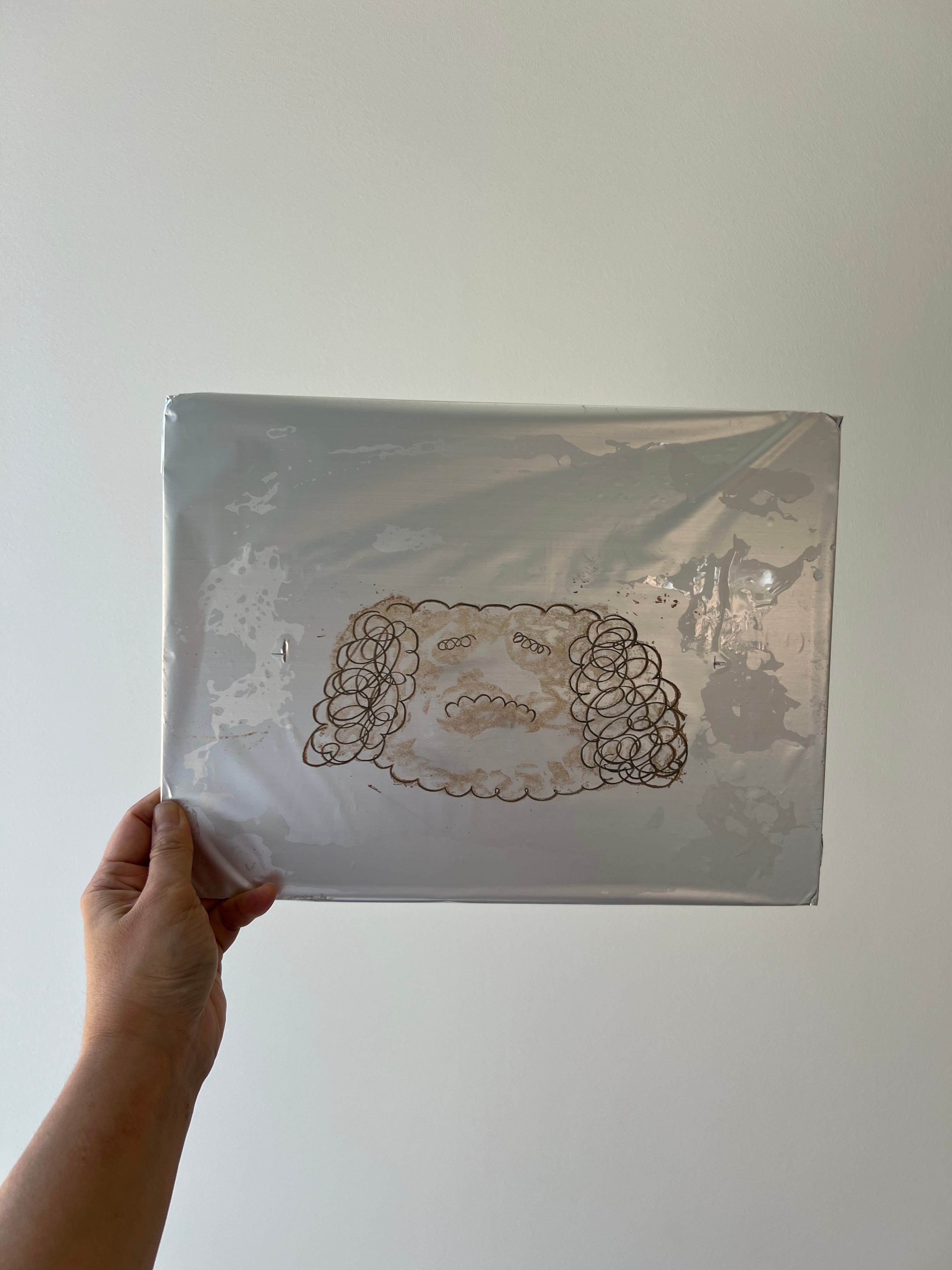
You’ll see that the bottom two prints have thicker lines and this was because I was starting to lose the line integrity in the plate (it was getting smudgey and ink was globbing on). With that said, the registration system seems to be working because the dark brown curly details are properly lined up over the light brown “base”. Hooray!
Again, I waited another day for this to dry.
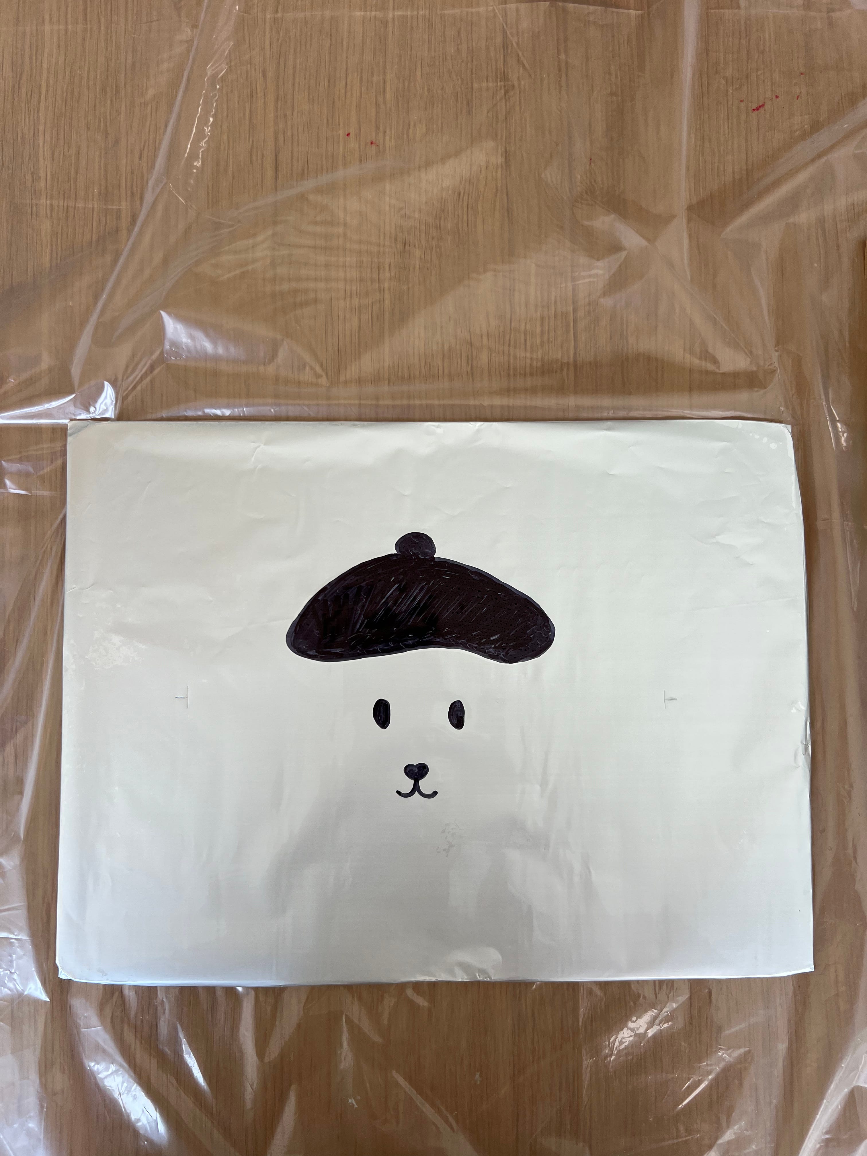
Day 3: This is where things start to get chaotic. I figured I could kill two birds with one stone and do both the eyes, and the hat on the same plate— even though I wanted them to be two different colours (black, and cobalt blue).
Here is my first plate looking pretty cute:
Anddd it was a hot mess. I think perhaps the acid/ coke didn’t etch the sharpie in as well as it would with a greasy crayon? OR the plate wasn’t wet when I rolled on the ink (again, water repelling oil). This led to the ink sticking to weird places and just looking real bad.


And so, I tried again, this time using greasy crayon and chocolate for the hat. The little dog went from being french to russian real fast 😂. At this point I’m thinking I’m messing something up with the acid process. Perhaps I need to paint it in instead of pouring the coke willy nilly over the entire plate?


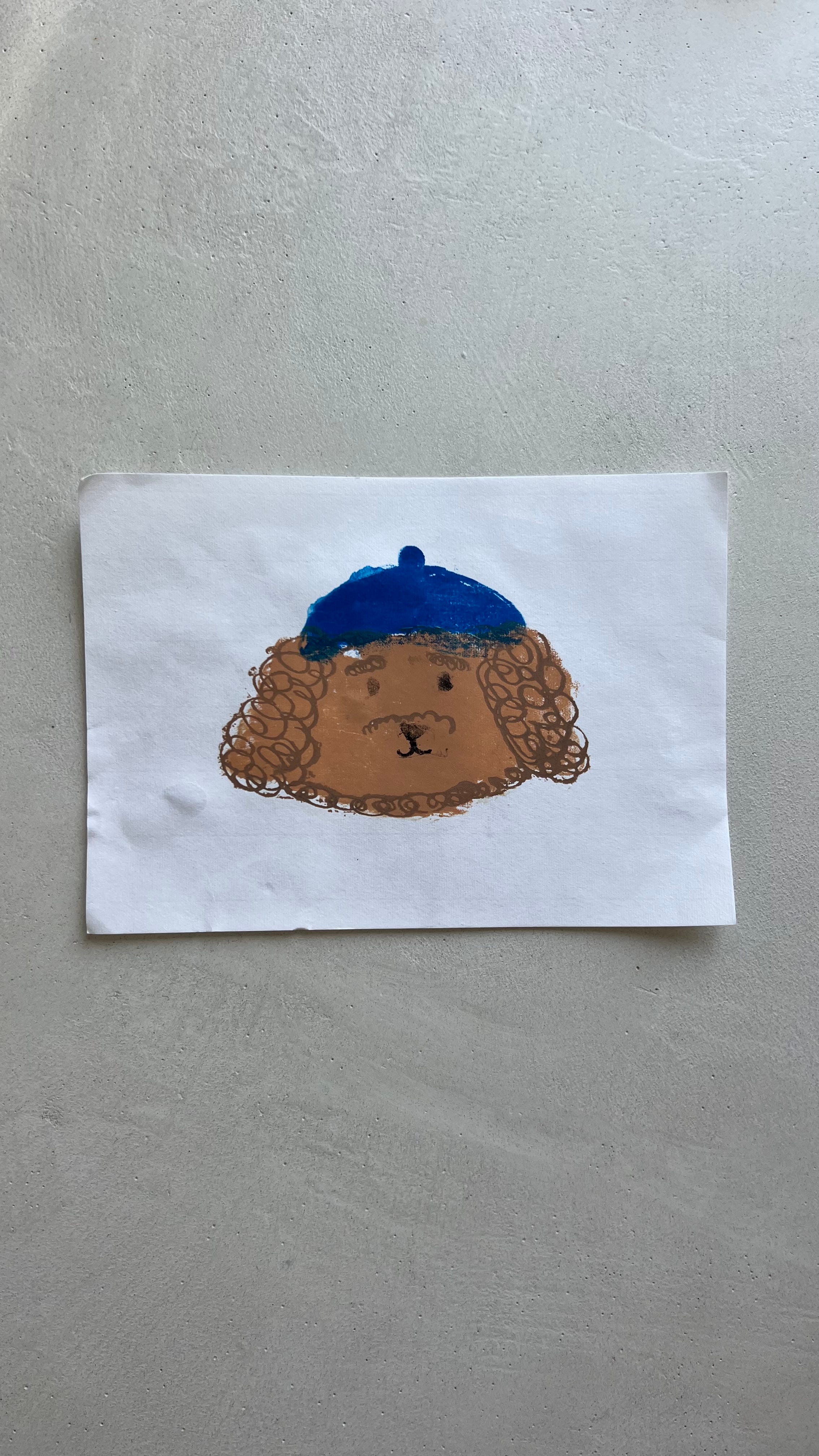
I persisted still because I was determined to get at least one good print so despite everything indicating it was a bad idea, I rolled up some black ink for the eyes/ mouth.
Andd this was the result. It’s… OK… but not great. The blue is smudgey and the lines aren’t precise, plus the eyes aren’t inked up enough/ look a bit faded and wonky.
It was at this point that Rob found me shouting at nobody and I pulled the plug for the day.

“That’s not a very good story Auntie!!” my niece said, after I shared my kitchen lithography struggles with her.
And she’s right. In every book I’ve read about writing fiction for children, you are told to give the main character three moments where they are met with an obstacle, before the final “big boss” of the climax. And my kitchen litho story had all of this: the build up, the subsequent crash, the build up, the crash… the climb to the climax and then…. nothing. I can see why my niece was unsatisfied. This was not the rosy ending she’s been trained to expect.
In reality, I laughed and explained to her “yes, but it felt better to step away right now because I was too frustrated to do good work.”
I’d like to think that this isn’t the ending, but just a bookmark before the next chapter. Stay tuned (but don’t hold your breath).